objects.media
# Media
The Media object module is aleutcss’ implementation of Nicole Sullivan’s media object—the poster child of OOCSS.
To find out where it all started, read Nicole’s blog post.
Install using npm:
$ npm install --save-dev aleut.objects.media
Usage
Basic usage of the Media object uses the required classes:
<div class="o-media">
    <img src="/path/to/image.png" alt="" class="o-media__img" />
    <div class="o-media__body">
        <p>Text-like content goes here.</p>
    </div>
</div>
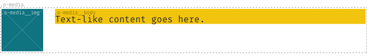
The only valid children of the .o-media node are .o-media__img and
.o-media__body.
Options
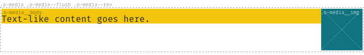
Other, optional classes can supplement the required base classes:
.o-media--flush: remove the space between the image- and text-content..o-media--[tiny|small|large|huge]: alter the spacing between the image- and text-content..o-media--rev: reverse the horizontal rendered order of the image- and text-content..o-media--responsive: a very basic responsive implementation of the media object. Pragmatic; far from perfect.
For example:
    <div class="o-media  o-media--flush  o-media--rev">
        <img src="/path/to/image.png" alt="" class="o-media__img" />
        <div class="o-media__body">
            <p>Text-like content goes here.</p>
        </div>
    </div>
Modify options
To modify the breakpoint of .o-media--responsive you can change this variable and set it to your preferred option before you import the _objects.media.scss-file.
$o-media-collapse-at: 720px !default;
Dependencies
aleutcss’ Media object depends on three other aleutcss modules:
If you install the Media object using NPM, you will get these dependencies at
the same time. If not using NPM, please be sure to install and @import these
dependencies in the relevant way.