Getting started with Aleut.css
Aleut.css is a fork of inuitcss. It is a powerful framework designed with scalability and performance in mind. Inuit was left alone a little too long, so we made a more opinionated version with a lot of the ideas proposed by Harry Roberts, easier variable-names and fewer choices. If you are used to inuitcss, aleutcss should be more or less plug and play. If you wonder what this is and how you can use it, please read on.
Core ideas
- Mostly off by default. Turn on what you need
- Override defaults by declaring the variable before the package import
- Build your project based on the objects in Aleut
- Personalize by making components that either adds to, or builds on the objects
- If you’re on your self, go wild with scss, if your code are to be read by others, keep it boring and readable.
“Let me just try this thing”
tl;dr. Download the starter. Uncomment some of the imports under objects and set the variables to
true. Runnpm startin the command line. Tweak some stuff and see how things change. The css-file is generated inn/css/style.css
We get it, you just want to test this thing out before you invest time in reading about stylesheet structures and CSS-philosophies. Aleut is pretty well documented throughout the whole framework. You’ll find documentation within the stylesheet files, in each of the repositories, and of course, at this website. While it may seem a bit daunting at first glance, trust us, the concepts behind Aleut.css is few and basic.
You could download all the packages from Github in zip-files, but that’d make it pretty unmaintainable. Aleut.css is distributed with node package manager, which makes installing it in a project easy as a breeze. If you’re not familiar with the npm tool in the command line, do yourself a huge favor and familiarize yourself with it. You’ll thank us later.
Aleut.css is built with Sass. Chance is that you’re already familiar with how Sass works. If not, Aleut.css is a great way to start learning. We’ll cover how you import the packages into your stylesheet, and how to build the CSS-files for your web project.
Aleut.css from scratch
We have made a starter package that includes all the starter packages. It should be enough to get you going.
If you’re starting a new project from scratch it’s easiest to just download the zip-file directly. You can also do it all from the command line:
# Download or clone the starter package and save it as a project dependency
$ wget https://github.com/aleutcss/starter/archive/master.zip
# Unzip the zip file
$ unzip master.zip
# Navigate into the starter folder
$ cd starter
# Download all the project dependencies with npm
$ npm i
$ npm start # or bring your own compiler
Getting Aleut.css into an existing project
If you already have a package.json-file in your project, just run this command in terminal to save the Aleut.css essentials as dependencies.
$ npm install aleut.base.images aleut.base.lists aleut.base.page aleut.generic.box-sizing aleut.generic.normalize aleut.generic.reset aleut.generic.shared aleut.objects.block aleut.objects.box aleut.objects.buttons aleut.objects.flag aleut.objects.layout aleut.objects.list-bare aleut.objects.list-block aleut.objects.list-inline aleut.objects.list-ui aleut.objects.media aleut.objects.pack aleut.objects.tables aleut.objects.tabs aleut.settings.defaults aleut.settings.responsive aleut.tools.clearfix aleut.tools.functions aleut.tools.mixins aleut.tools.responsive aleut.tools.widths aleut.utilities.clearfix aleut.utilities.headings aleut.utilities.print aleut.utilities.responsive-spacing aleut.utilities.responsive-widths aleut.utilities.spacing aleut.utilities.widths --save-dev
You will now have a bunch of new stuff in your npm-folder (usually called node_modules). That’s Aleut.css ready to do its work. But first you’ll have to import them into your sass-project with the sass @import function. We have prepared a style.scss for you to download into your scss-folder.
Open and browse through the style.scss file. You’ll notice that it has some documentation and a bunch of @import tags. If you imported Aleut.css into an existing project you’ll have to make sure that the import path is correct.
starter
├── node_modules
  ├── base.lists
  ├── base.page
  ├── …
├── components
    ├── compontent.icon.scss
├── style.scss <= $path:"/nodes_modules"
In an existing project, you’ll probably want to keep all the stylesheet files in their own sass folder. The path should be set relative to styles.scss.
project-folder
├── node_modules
  ├── base.lists
  ├── base.page
  ├── …
├── sass
  ├── components
    ├── compontent.icon.scss
  ├── style.scss <= $path:"../nodes_modules"
Similarly, if you prefer to have all vendor packages in one folder, you’ll have to set path accordingly.
project-folder
├── vendors
  ├── bower_components
  ├── node_modules
    ├── base.lists
    ├── base.page
    ├── …
├── sass
  ├── components
    ├── compontent.icon.scss
  ├── style.scss <= $path:"../vendors/nodes_modules"
Now, go back to styles.scss. There’s a lot of thinking behind the structure of this file, but for now, the only thing you should now is if you compile this file, you’ll get some generic settings and resets. To make use of the objects, you’ll have un-comment them. The idea behind this framework is to compile what you use.
Lets say you want to make a small button component. Aleut.css comes with objects.buttons with some predefined rules for how a button element. By importing this file, you can make use of the o-btn class, which makes button-objects behave a bit better. It has also some predefined options, which may come in handy. These are turned off by default. To enable them, you’ll have to set the variable to true before the line, which imports the object.
$o-btn--small: true; // <= overrides $o-btn-small: false !default;
@import "../node_modules/aleut-buttons/objects.buttons.scss";
The same logic applies to default values. If you want to change them, just declare the variable before the @import line.
$btn-background:      #BADA55;
$btn-radius:          3px;
$o-btn--full:         true;
@import "node-modules/aleut-buttons/objects.buttons";
Understanding Aleut.css
Structure
Aleut.css is based upon 35 different packages loaded in specific layers to remain in control of specificity and structuring your project. The order of partials within each layer is fairly open; it is the sections themselves that are important to get in the correct order.
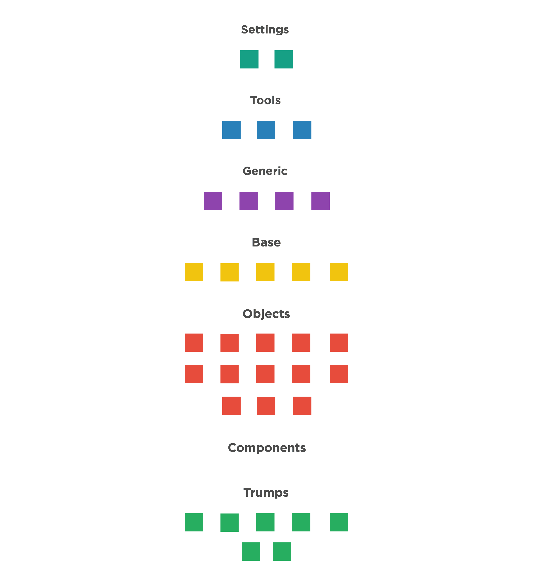
Settings
Global variables, site-wide settings, config switches, etc. (just code for SCSS)
Tools
Site-wide mixins and functions. (just code for SCSS)
Generic
Low-specificity, far-reaching rulesets (e.g. resets).
Base
Unclassed HTML elements (e.g. a {}, blockquote {}, address {}).
Objects (o-prefix on the class-names)
Objects, abstractions, and design patterns (e.g. .o-media {}).
This is code that has no visual style and that you can move from project to project.
Components (c-prefix on the class-names)
Discrete, complete chunks of UI (e.g. .c-carousel {}). This is the one layer that aleutcss doesn’t get involved with. The balance between adding objects and components to the same object is the key to understand Aleutcss.
Utilities (u-prefix on the class-names)
High-specificity, very explicit selectors. Overrides and helper classes (e.g. .u-hidden {}) as well as grids.
Modifying aleut
Since all the aleut-files are imported via npm you should not modify the files directly. You should rather edit the variable before you @import the specific file. Let’s take f.ex. the button-object: If you want to change the default button works you edit it like this:
css
$btn-background:      #BADA55;
$btn-radius:          3px;
$o-btn--full:         true;
@import "node-modules/aleut-buttons/objects.buttons";
It is also important to underline that some times it is more correct to create a new CSS-class as a modifier. See more in components
Off by default
As you’ve seen aleut consist of a lot of different files. This is so that you just import the files you need. But we have another layer of reduced bloat: all variants are switched off by default. So if you just want buttons, you don’t get every different size and version of them unless you explicitly turn them on.
To turn features on, just set their switches to true (again, before you @import the file):
css
$o-btn--full:    true;
@import "node-modules/aleut-buttons/objects.buttons";
Extending aleut
Another good thing about the structure of aleut and it’s packages is that you can add your own functionality in and around aleuts code. By doing this you can grow your codebase in any direction and create your own partials and objects as long as you follow the same structure.
To extend aleut, simply create a partial in the <section>.<file> format as the rest of the files, and @import it wherever it is needed.
Components
Aleut.css does its best to stay away from any cosmetic styling. You can therefore use it on any project without the same look-and-feel. If you do require a UI out of the box, then inuitcss is probably not the best tool for you.
Because aleut does no cosmetic styling, it is up to you to author the Components layer. A good example of this could be a main navigation of a site. First you mark it up as an <ul>, then you add the object .o-list-inline to make the menu horizontal, to style it to your liking you create a new file called _components.site-nav.scss and add the class .c-site-nav to the .o-list-inline and style it to your liking.