objects.block
# Block
The Block object simply stacks an image on top of some text content.
This incredibly frequently occurring design pattern is now wrapped up in a simple, reusable, configurable abstraction.
Install using npm:
$ npm install --save-dev aleut.objects.block
Usage
Basic usage of the Block object uses the required classes:
<div class="o-block">
    <img src="/path/to/image.png" alt="" class="o-block__img" />
    <div class="o-block__body">
        <p>Text-like content goes here.</p>
    </div>
</div>
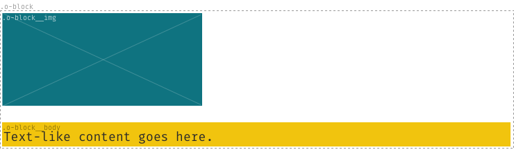
The only valid children of the .o-block node are .o-block__img and
.o-block__body.
Options
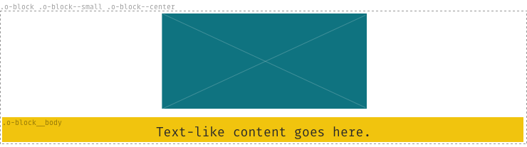
Other, optional classes can supplement the required base classes:
.o-block--flush: remove the space between the stacked image- and text-content..o-block--[tiny|small|large|huge]: alter the spacing between the stacked image- and text-content..o-block--[center|right]: align both the image- and text-content.
For example:
<div class="o-block  o-block--small  o-block--center">
    <img src="/path/to/image.png" alt="" class="o-block__img" />
    <div class="o-block__body">
        <p>Text-like content goes here.</p>
    </div>
</div>
Enable options
To enable the optional classes set the variables to true before you import
the _objects.block.scss-file.
$o-block--flush:     false;
$o-block--tiny:      false;
$o-block--small:     false;
$o-block--large:     false;
$o-block--huge:      false;
$o-block--center:    false;
$o-block--right:     false;
Dependencies
The Block object depends on two other aleutcss modules:
If you install the Block object using NPM, you will get these dependencies at
the same time. If not using NPM, please be sure to install and @import these
dependencies in the relevant way.