objects.layout
# Layout
The layout system is a powerful, flexible, highly advanced evolution of
the traditional grid system. It is based on
csswizardry-grids.
Let’s get this over with: It is based on inline-blocks. That means three things:
1. We don’t have to use floats and clearfixes. Yay!
2. We can easily flip the layout, center it by just adding one class.
3. Since we use inline-block we unfortunately can’t have spaces between the columns. Two columns at 50% = 100%. If we then add a space we’re on more than 100% which doesn’t add up. This means that we need to remove the spaces between the columns either with placing the columns close like this: </div><div class="o-layout__item">, by commenting between the closing and new opening tag (like in our example under), or by wrapping around a spaceless tag (in the TWIG) or similar that removes whitespace.
This layout-system is combined with the width-classes found in utilities.widths and utilities.widths-responsive
Install using npm:
$ npm install --save-dev aleut.objects.layout
Usage
Basic usage of the Block object uses the required classes:
<div class="o-layout">
	<div class="o-layout__item u-1/2">

	</div><!--
 --><div class="o-layout__item u-1/2">

    </div>
</div>
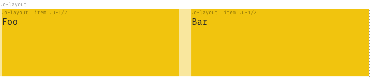
The only valid child of the .o-layout node is .o-layout__item.
Options
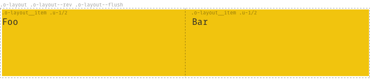
Other, optional classes can supplement the required base classes:
.o-layout--flush: remove the space between the columns.o-layout--[tiny|small|large|huge]: alter the spacing between the columns.o-layout--middle: Align layout items to the vertical centers of each other..o-layout--bottom: Align layout items to the vertical bottoms of each other..o-layout--right: Make the layout items fill up from the right hand side..o-layout--center: Make the layout items fill up from the center outward..o-layout--auto: Cause layout items to take up a non-explicit amount of width..o-layout--rev: Reversed rendered order of layout items, e.g. items 1, 2, 3, 4 in your markup will display in order 4, 3, 2, 1 on your page.
For example:
<div class="o-layout o-layout--rev o-layout--flush">
	<div class="o-layout__item u-1/2">

	</div><!--
 --><div class="o-layout__item u-1/2">

    </div>
</div>
Enable options
To enable the optional classes set the variables to true before you import
the _objects.layout.scss-file.
$o-layout--tiny:     false !default;
$o-layout--small:    false !default;
$o-layout--large:    false !default;
$o-layout--huge:     false !default;
$o-layout--flush:    false !default;
$o-layout--rev:      false !default;
$o-layout--middle:   false !default;
$o-layout--bottom:   false !default;
$o-layout--right:    false !default;
$o-layout--center:   false !default;
$o-layout--auto:     false !default;