objects.flag
# The flag object
The flag object module is an object similar in appearance to the media
object, but which provides slightly
more advanced functionality like vertical alignment. The flag-object is a bit more verbose than the media-object and based on display: table; which at times can cause some trouble. Read Harry Roberts article on The Flag Object
Install using npm:
$ npm install --save-dev aleut.objects.flag
Usage
Basic usage of the flag-object uses the required classes:
<div class="o-flag">
    <div class="o-flag__img">
		<img src="image-here.png">
	</div>
	<div class="o-flag__body">
		Some text-like content here.
	</div>
</div>
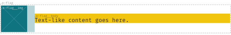
The only valid children of the .o-flag node are .o-flag__img and
.o-flag__body.
Options
Other, optional classes can supplement the required base classes:
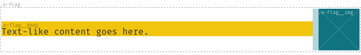
.o-flag--flush: remove the space between the image and the text..o-flag--[tiny|small|large|huge]: alter the spacing between image and the text..o-flag--rev: Switches the direction of the image and the text..o-flag--[top|bottom]: Specify the location of the image relative to the text. The default is centered..o-flag--responsive: If the flag-object should break with image over the text on a breakpoint.
For example:
<div class="o-flag o-flag--rev o-flag--small">
    <div class="o-flag__img">
		<img src="image-here.png">
	</div>
	<div class="o-flag__body">
		Some text-like content here.
	</div>
</div>
Enable options
To enable the optional classes set the variables to true before you import
the _objects.flag.scss-file.
$o-flag--tiny:       false !default;
$o-flag--small:      false !default;
$o-flag--large:      false !default;
$o-flag--huge:       false !default;
$o-flag--rev:        false !default;
$o-flag--flush:      false !default;
$o-flag--top:        false !default;
$o-flag--bottom:     false !default;
$o-flag--responsive: false !default;
Modify options
To modify the breakpoint of .o-flag--responsive you can change this variable and set it to your preferred option before you import the _objects.flag.scss-file.
$o-flag-collapse-at: 720px !default;